Perfect with every click
Why is responsive web design so important today? What are the consequences if a website does not work on different devices? And how do companies benefit when their site automatically adapts to every device? In this article, we take a look at what makes good responsive design, what advantages it offers, and what you should definitely pay attention to.
What is responsive web design?
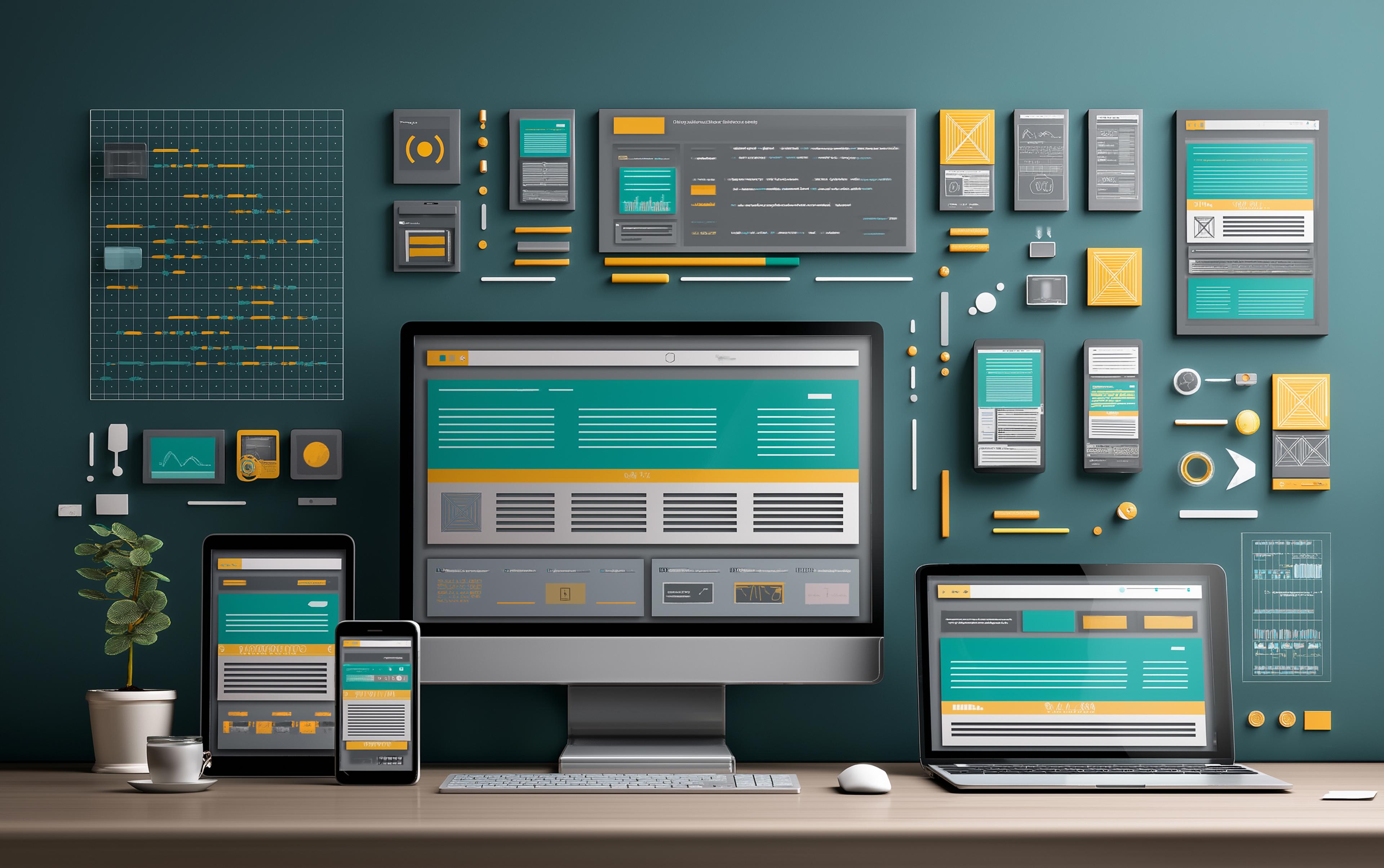
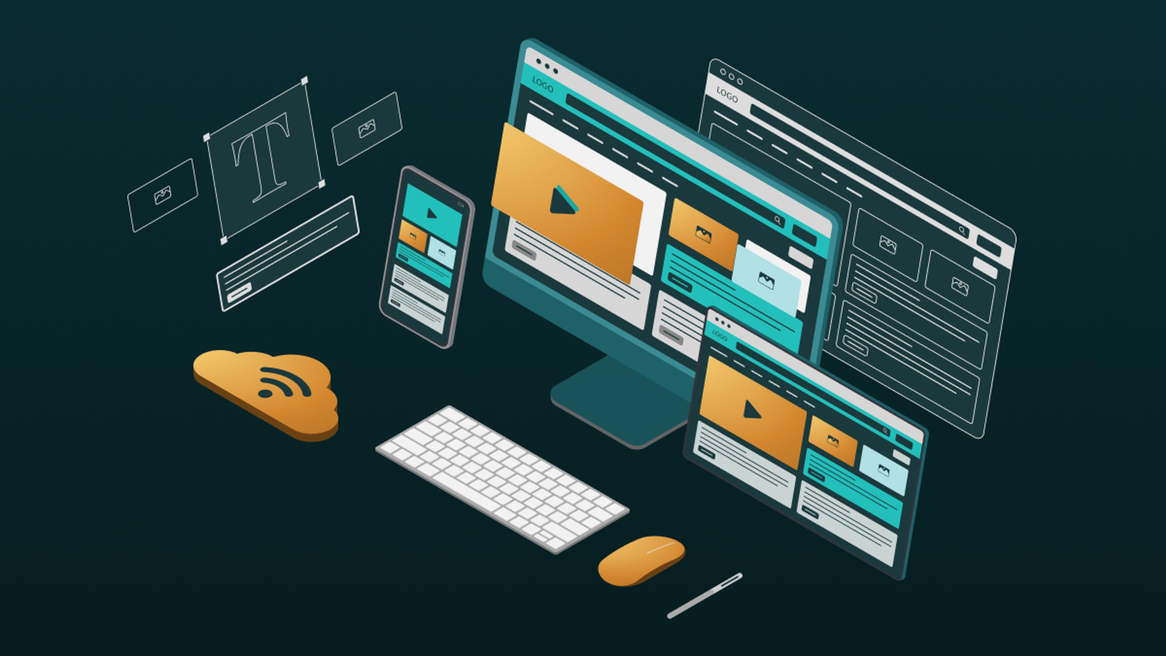
Responsive web design is an approach to web development that aims to design websites in such a way that they adapt to different screen sizes and resolutions. This is achieved through flexible layouts, images, and CSS media queries, which enable the website to look good and function well on any device.
The basics of responsive web design
Modern websites use flexible layouts that do not work with fixed pixel values, but with relative units such as percentages. This means that the arrangement of text, images, and boxes automatically adapts to the screen size, regardless of whether someone is viewing the page on a small smartphone or a large desktop monitor.
Media queries are used in CSS to ensure that certain areas look different. Developers write rules that say: "If the display is less than 600 pixels wide, arrange menus one below the other" or "Use larger font styles for widths of 1200 pixels or more." This allows the layout to appear more compact on a mobile phone, while appearing spacious and expansive on a desktop.
Images are also implemented flexibly: instead of having fixed widths, they automatically adapt to the width of the container in which they are displayed. On a small display, the image is reduced in size so that it does not extend beyond the screen, and on a larger monitor, it makes optimal use of the available space without distorting. This ensures that the entire page layout always remains clear and user-friendly.
Advantages of responsive web design
The implementation of responsive web design offers numerous advantages that are important for both website operators and users.
Improved user experience
The implementation of responsive web design ensures a significantly improved user experience. A website that automatically adapts to the screen size and the respective device looks equally good on smartphones, tablets, and desktop PCs and functions smoothly. This makes visitors feel more comfortable, stay on the site longer, and consume more content. Especially for mobile users, easy navigation and fast loading times are crucial to prevent them from leaving the site. A positive user experience also often has a direct impact on the conversion rate, i.e., how many visitors complete a desired action such as a purchase or an inquiry.
Cost efficiency
Responsive web design is also very advantageous from an economic perspective. Instead of developing and maintaining separate websites or apps for different devices, a single responsive website is sufficient. This not only saves a considerable amount of time and resources during development, but also makes ongoing maintenance much easier and cheaper. Changes only need to be made once, which reduces the likelihood of errors and makes maintenance more efficient. Website operators thus benefit from a cost-effective solution in the long term.
Better SEO rankings
Search engines favor responsive websites because they ensure a consistent and positive user experience across all devices. A uniform URL structure also makes it easier for search engines such as Google to index content. This often leads to better rankings in search results and increases the organic visibility of the website. As a result, responsive websites attract more visitors and increase their reach, which is a clear advantage in the competition for potential customers.
Future scalability
The variety of devices and screen sizes is constantly growing, from new smartphones to large monitors and wearables. Responsive web design offers the flexibility to adapt to these new technologies without the need for extensive redevelopment. This scalability ensures that your website will continue to be displayed optimally in the future and reach a broad target audience. This makes responsive web design a sustainable and future-proof solution for modern web projects.
Choosing the right web design agency
Choosing the right web design agency is crucial to the success of your project. Here are some factors you should consider:
Experience and expertise as well as customer reviews
When selecting an agency, you should first check whether it has proven experience in responsive web design. A look at its portfolio and references from previous projects will give you an idea of whether the agency has the necessary skills. It is also worth reading reviews and case studies from previous clients to get an impression of how the agency works and the actual results it achieves. This will help you determine whether the agency's quality and style match your expectations.
Communication skills and value for money
Smooth communication is crucial for the success of a project: make sure that the agency is open to feedback, provides regular updates on progress, and responds quickly to your questions. At the same time, value for money plays an important role. Compare the offers of different agencies, but don't be guided solely by price. Sometimes it is worth investing in a more expensive agency that delivers better results in the long term, thus saving costs in the long run.

Steps taken by an agency for responsive web design?
Consulting
The first and arguably most important step in creating a website is the consultation. This is where you and the agency meet to lay the foundations for the entire project. You discuss which target groups the website should appeal to, which functions are required, and what goals you want to achieve with your online presence—whether that's attracting new customers, increasing brand awareness, or selling products. In addition, a joint decision is made on what content—text, images, videos, or other media—should be presented on the various pages. Another key point is the definition of measurable criteria that can be used later to evaluate the success of the website. This thorough planning ensures that everyone involved is on the same page from the outset and that the website is developed in a targeted manner.
Design
Based on the consultation, initial drafts are created in the form of sketches for the individual web design. These show where important elements such as headings, images, and buttons will be placed on the pages. These drafts serve as a rough roadmap for the design. Detailed design examples are then developed from the sketches, which already take different screen sizes into account. This ensures that the website remains appealing and functional on smartphones, tablets, and large desktop screens. This phase allows you to experience the look and feel of the website and the user guidance before the actual programming begins and to provide feedback. This means that design requests can be made and adjusted at an early stage, avoiding later changes and additional costs.
Development
Once the design has been finalized, the technical implementation begins. The developers program the website using modern web technologies that ensure it is displayed optimally on all devices—from small smartphones to large desktop monitors. Not only is static content implemented, but interactive elements such as drop-down menus, image sliders, and embedded videos are also integrated. An important part of the development process is setting up a content management system (CMS) that allows you to edit and update content yourself later on without having to rely on programmers. This keeps your website flexible and allows it to be quickly adapted as needed.
Test phase
Before the website is published, it undergoes an extensive testing phase. During this phase, various aspects are checked: for example, how quickly the page loads, whether all functions such as contact forms or shop modules work without errors, and whether the display works flawlessly in different browsers and on different devices. User-friendliness is also tested to ensure that visitors can intuitively find their way around the site. Errors and problems discovered during this phase are fixed by the development team. Only when all tests have been successfully completed and the website is running smoothly is it approved for launch.
Launch & Maintenance
Once all tests have been successfully completed, the website is transferred to the live server and made accessible to the public. The agency sets up a secure connection, which can be recognized by the small padlock symbol in the browser – an important protection for visitors' data. To ensure fast delivery of content worldwide, the agency often uses content delivery networks (CDNs). But the collaboration doesn't end with the launch: the agency also takes care of the ongoing maintenance of your website, including regular security updates, performance monitoring, and backups that enable quick restoration of the website in case of an emergency. This ensures that your website not only remains secure, but also stays up to date and functional.
Conclusion
Responsive web design is an essential part of any modern website. It improves the user experience, saves costs, and contributes to better SEO rankings. When choosing a web design agency, you should pay attention to experience, customer reviews, communication skills, and value for money. With the right agency, you can ensure that your website works optimally on any device and effectively appeals to your target audience.
In a world where mobile devices are increasingly dominant, responsive web design is not just an option, but a necessity. Invest in a responsive website to improve the user experience and strengthen your online presence.