A laptop floats in the air with design software windows open on the screen

Your brand in the perfect light
Develop an unmistakable brand identity and present your company professionally and consistently on all channels.
Awarded by professionals, loved by clients
- German Web Awards 2025 winner, rated well above the industry average.
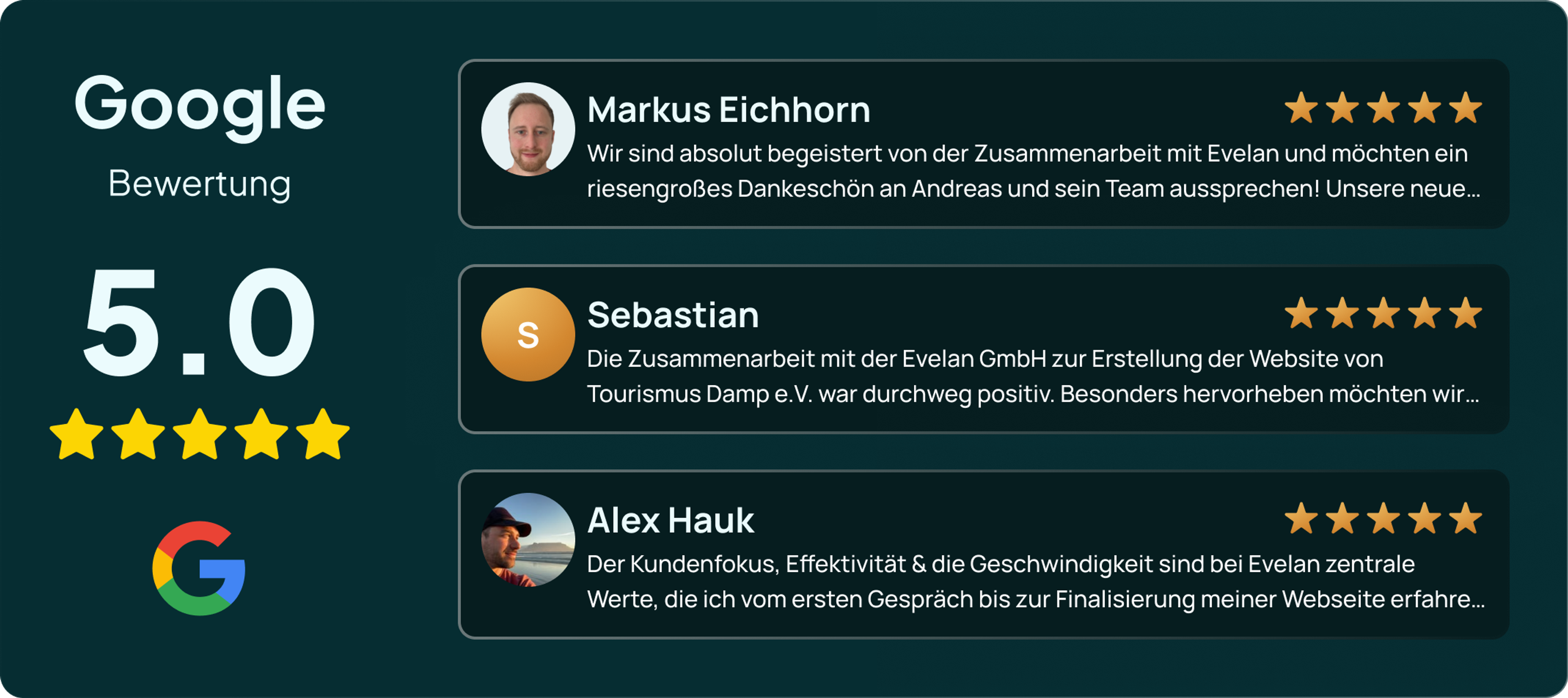
- Plus 5.0 ★ Google reviews as a mark of quality and reliability.

Does any of this sound familiar?
Many mid-sized companies do excellent work. From the outside, that is rarely visible.
Your brand does not stick
Prospects remember the conversation but not your name. Next to your competitors you look interchangeable, even though your work is anything but.
Every channel looks different
Website, proposal template, trade fair stand and LinkedIn come from different years and different suppliers. The overall impression falls apart.
Nobody knows what applies
Without written rules, every employee and every agency decides colours, fonts and imagery again from scratch. Each of those decisions costs time.
You look smaller than you are
A messy appearance makes an established company look like a newcomer. You feel it at the latest in the price negotiation.
A brand is more than a logo
A logo is the result, not the starting point. Before we design anything, we clarify what your company stands for, who you address and what sets you apart. Only then does an appearance emerge that fits you rather than a template.
We build your brand as one coherent system. Colours, fonts, shapes and imagery work together and are documented so your team can apply them without asking. The result works on the website just as well as on a proposal, a business card or a trade fair stand.
Because brand and website are built under one roof, the usual break between design and implementation disappears. Your corporate design is stored in the content management system, so every page your team creates later matches it automatically.


What we build for your brand
You do not get a single logo but a complete system. Every building block is documented so your team can apply it independently.
Brand core and positioning
We sharpen what you stand for and who you serve. From that we derive messages you can use in every conversation and on every page.
Logo and wordmark
A logo that stays legible in an email signature as well as on vehicle lettering. Including every file format for print and web.
Colour palette
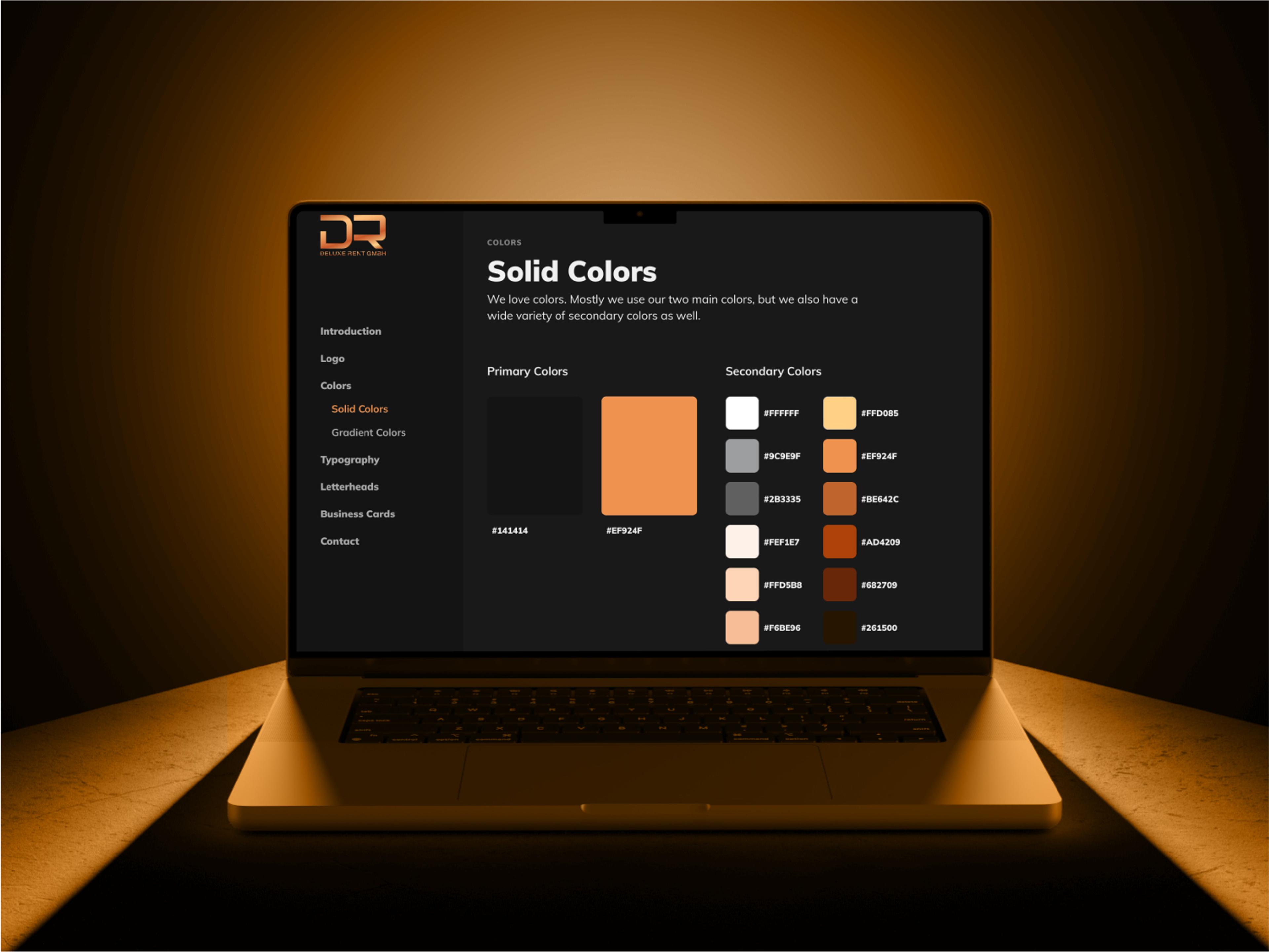
Coordinated primary and secondary colours with verified contrast, so your appearance also meets accessibility requirements.
Typography
A type family with a clear hierarchy for headings, body text and highlights. We settle the licensing questions along the way.
Imagery
Guidelines for motifs, framing and editing, so photos from different sources visibly belong together.
Style guide
All rules in one document that your team and external suppliers can apply without any onboarding.
Ready for an appearance that fits you?
In a free first consultation we look at your current appearance and tell you honestly where the biggest lever is.
How your brand takes shape
Four steps in which you always know where you stand.
Analysis
We look at your market, your competitors and your current appearance. Together we clarify positioning and audience.
Concept
You receive different design solutions, each with its reasoning. You decide which one we pursue.
Development
The chosen direction is worked out into a complete system and documented in a style guide.
Rollout
We carry the new brand across website, stationery and templates. Your team gets a walkthrough.
Brands we have built
From product branding to personal brands. A selection of our projects.

For DRIVANO, we developed a complete brand identity from the ground up, ranging from corporate identity and professional product imagery to the finished website design. With a well-designed online catalog, targeted SEO optimization, and high-quality content, we established a strong market presence for this premium lubricant brand right from the start.

The customized website for VITA CoRe, a personnel consulting and recruitment company, underlines the high quality standards of its services. With a modern design and intuitive user guidance, VITA CoRe clearly stands out from its competitors, while customers can access all relevant information quickly and efficiently.

For marketing consultant Alex Hauk, we took the digital profile we had built together several years ago to the next generation. Existing corporate design modernised, new headless CMS architecture based on Sanity and Vercel, live preview for daily editing, plus a careful, SEO-safe migration without ranking loss.
The result: a website that Alex Hauk now manages entirely himself, rebuilt from the ground up in ten weeks.

The complete website relaunch and the new branding for Curatax underline the serious and solid character of the company. With a modern design and an intuitive content management system, job advertisements can be easily updated. The website loads at lightning speed and has led to a significant increase in applications shortly after launch - Curatax is now more clearly and attractively positioned as an employer.
What our clients say
Our new website reflects exactly what VITA CoRe stands for - professionalism, quality and expertise. We were particularly impressed by the intuitive structure and the appealing design. Many thanks to the entire team at Evelan for the great work!

Competent, creative and always on time - our successful collaboration with Evelan
Very professional, open to new ideas and perfect timing!

We are super excited about the new website! Cool design, super user-friendly, communication was totally relaxed, all wishes were implemented perfectly. Top job, thanks Evelan!
Frequently asked questions
That depends on the scope. Logo, colour palette, typography and a compact style guide sit well below a full brand identity with imagery, stationery and website. We name the range in the first consultation, once we know what you need.