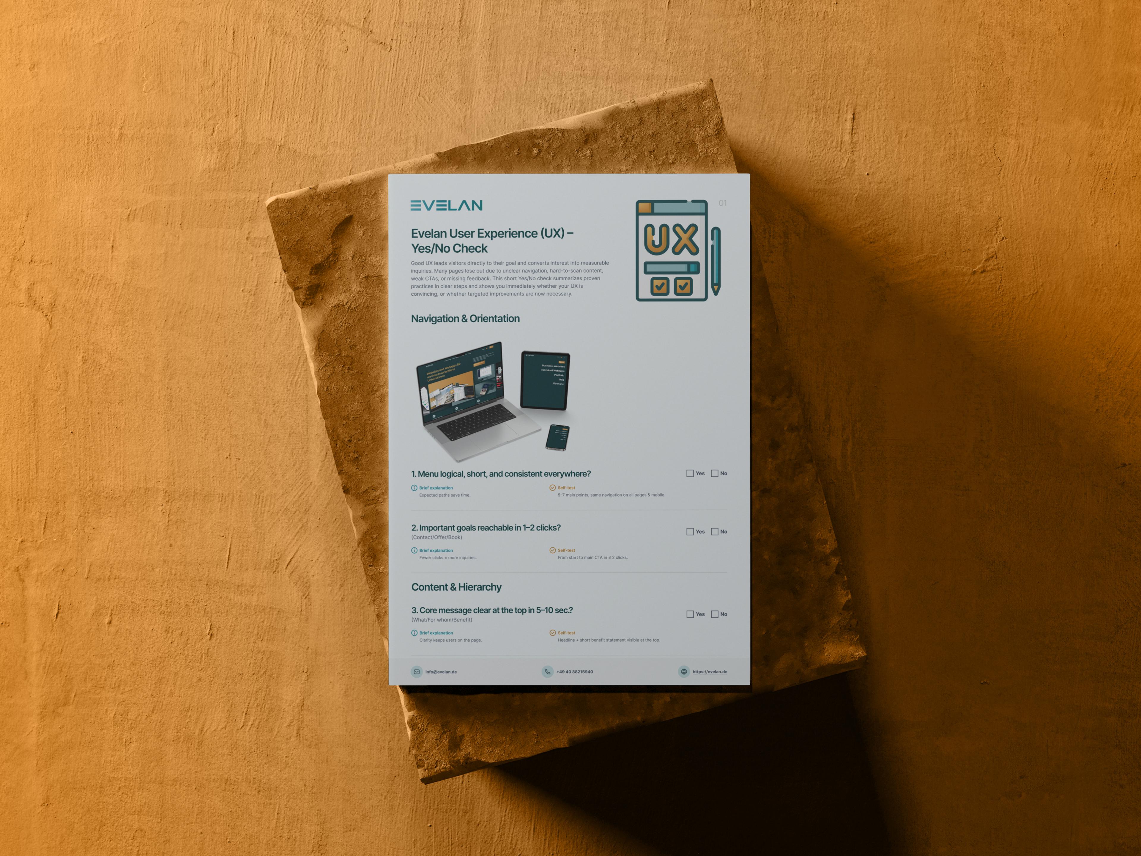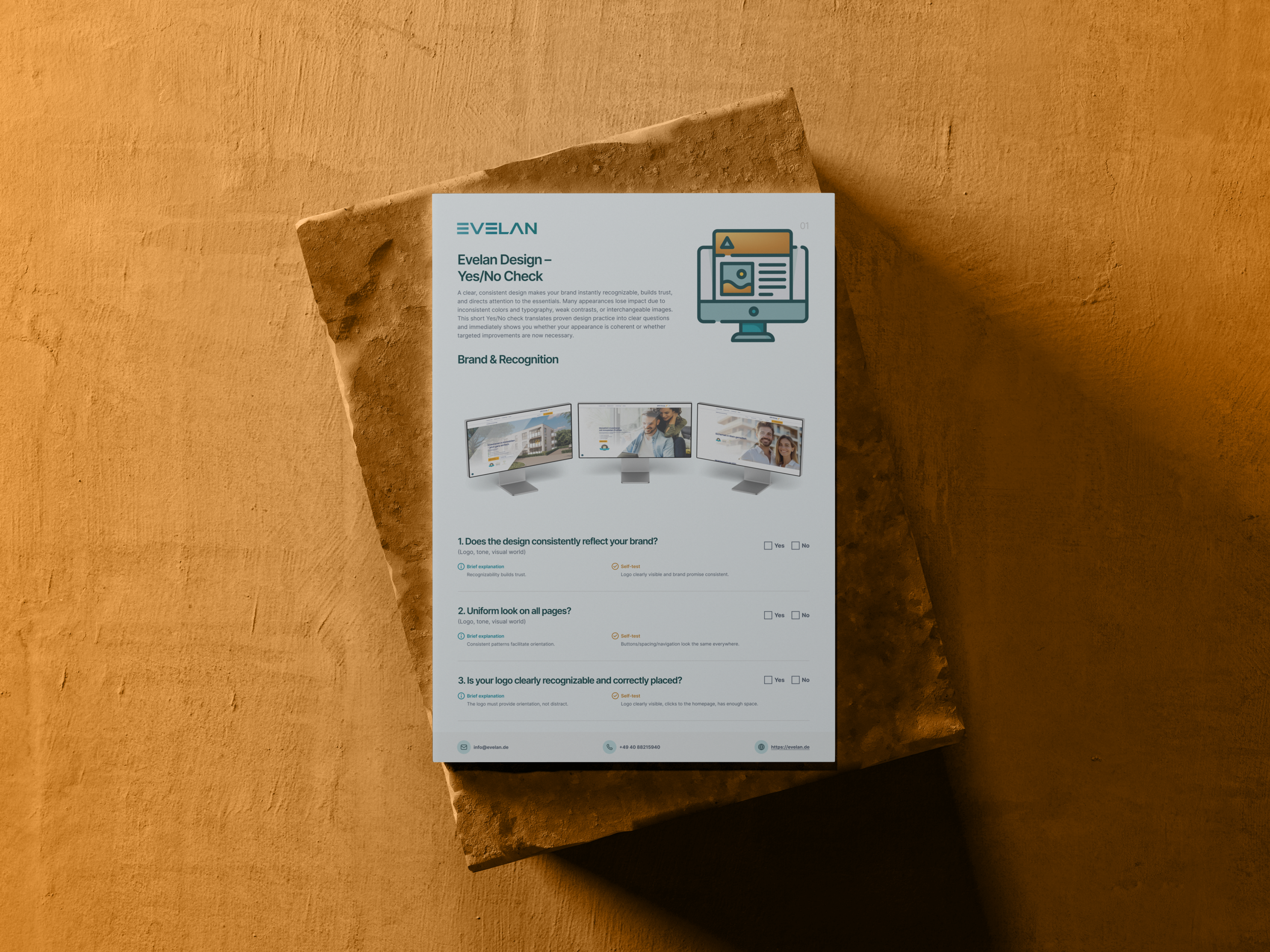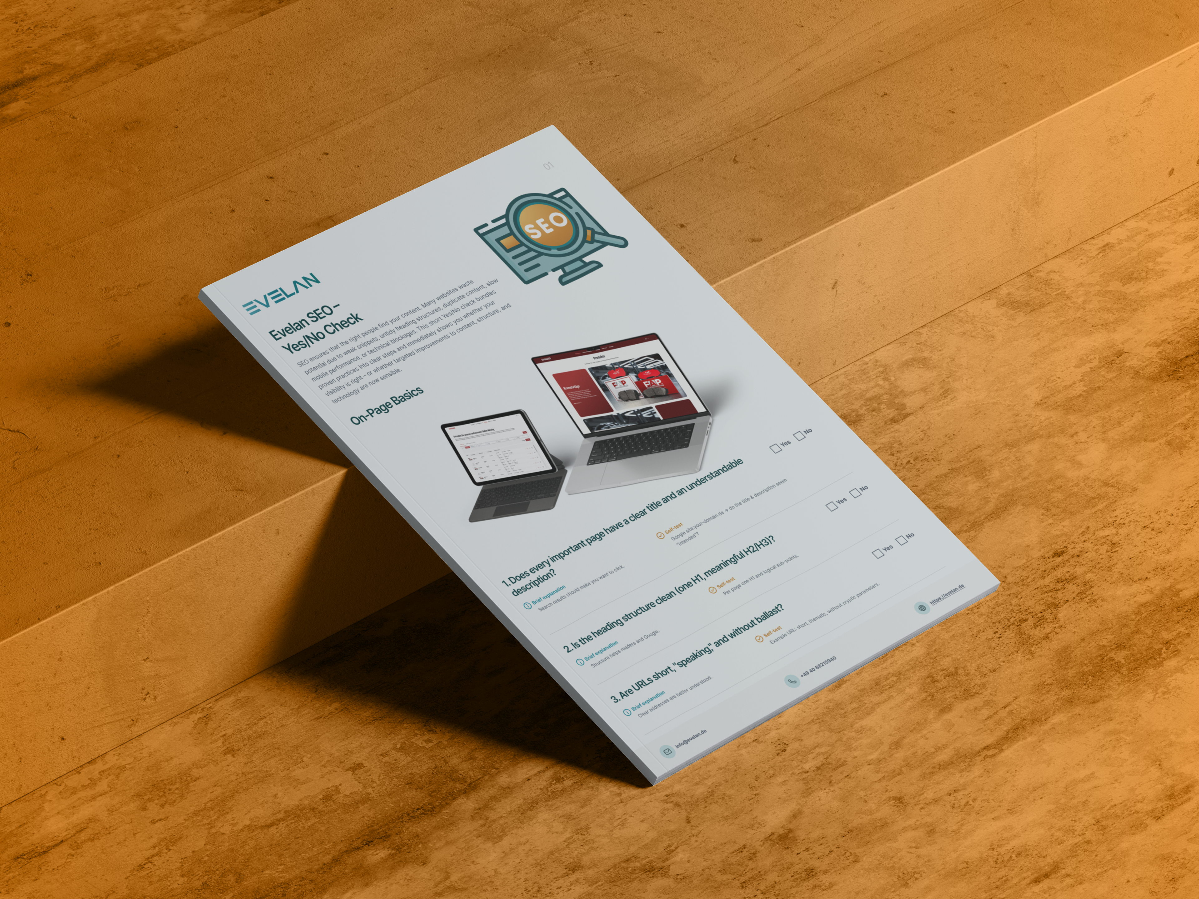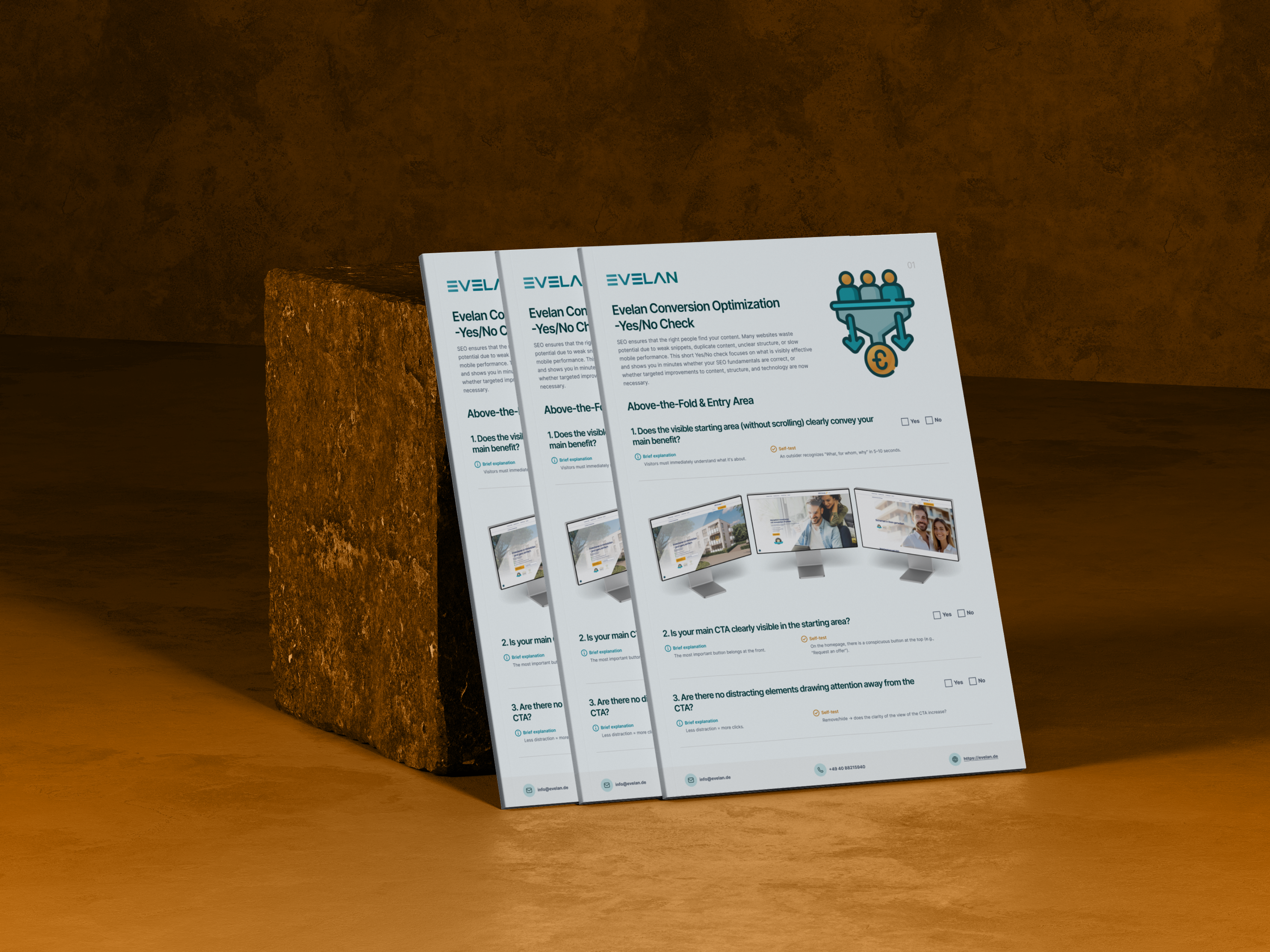
Conversion Optimisation Checklist
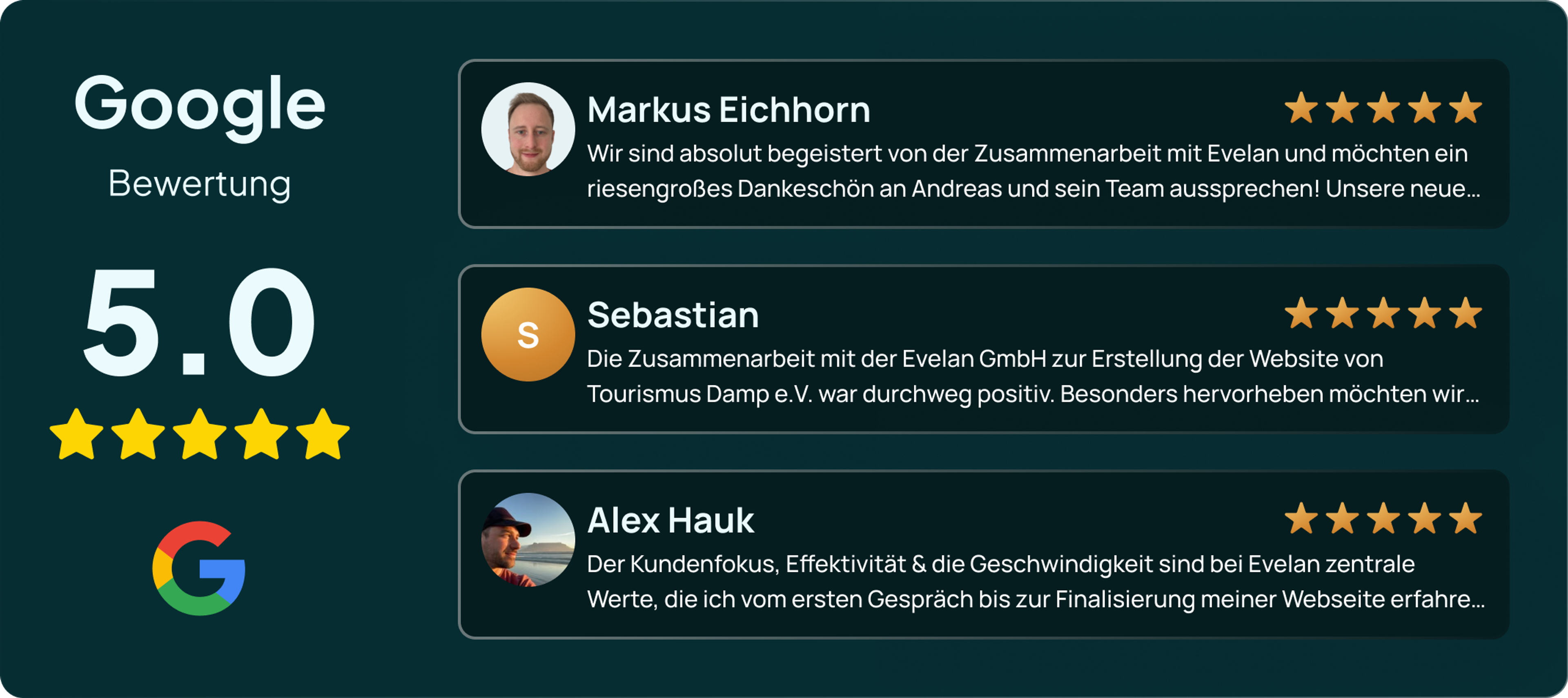
Traffic alone does not generate customers. Enquiries often fail not because of a lack of interest but because of small hurdles on the way to completion. Our free Conversion Optimisation Checklist uses 15 yes/no questions to reveal where visitors drop off, from the above-the-fold area through CTAs and click paths to forms and trust signals. With a 5.0-star Google rating, our clients confirm that Evelan designs websites that guide visitors purposefully towards action. Download the checklist and turn more visitors into enquiries.
What does the Conversion Optimisation Checklist cover?
15 checkpoints across 5 categories, a yes/no check for instant clarity on where your website is leaving conversions on the table.
Above the Fold & Entry
The visible entry area immediately conveys the main benefit, the primary CTA is prominent, and nothing distracts from the next step.
Call to Actions
Action-oriented button copy, one clearly identifiable main CTA on every page and a low-barrier alternative for undecided visitors.
Click Path & Scroll Depth
Contact, enquiry and phone number are reachable in three clicks or fewer, and the core message is available without extensive scrolling.
Forms & Checkout
A simple enquiry or checkout process, multiple convenient contact channels and a clear confirmation with an outlook on the next step.
Trust
Visible trust signals such as reviews, references and awards remove last doubts right where the CTA is.
More conversions in 3 steps
Download the checklist
Download the free PDF and get an overview of all 15 checkpoints across 5 categories.
Critically review your website
Examine every important page through the eyes of a visitor and note where the path to completion stalls.
Remove hurdles
Implement the most impactful improvements yourself or let the experts at Evelan handle the execution.
How Evelan builds your high-converting website
A website that sells is not created by accident but through clear guidance at every point of the user journey. That is exactly where we focus. From the initial analysis through user-flow design to ongoing optimisation, we think every page from the desired next step backwards, entirely in-house in Germany. The result is a website that does not just inform visitors but guides them calmly and without friction all the way to an enquiry or purchase.
1. Initial consultation
Free and without obligation, we analyse where visitors drop off on your website and what steps lie between interest and completion. This reveals which areas deliver the greatest return on optimisation.
2. Concept & user flow
We plan clear click paths, concise calls to action and a page structure that directs attention purposefully towards the next step. Every page gets a single clear goal instead of overwhelming visitors with too many options.
3. Development
We implement the optimised user flow with clean code, lean forms, fast loading times and well-placed trust signals. Everything is created 100 % in-house in Germany.
4. Ongoing support
After launch we observe visitor behaviour, test variations and continuously improve weak points. This way your conversion rate does not just rise once but keeps growing over time.
Why conversion optimisation determines your website's success
Most websites do not have a traffic problem; they have a completion problem. Visitors arrive, look around and leave again without taking the desired action. Conversion optimisation addresses exactly this. It ensures that as many visitors as possible actually become enquiries, purchases or calls. The point is rarely radical redesigns but rather many small friction points that collectively determine whether someone acts or abandons. Recognising and removing these hurdles extracts significantly more from existing traffic, entirely without additional advertising costs. A structured checklist makes visible exactly where your website wastes potential and where optimisation pays off fastest.
The first impression decides between staying and leaving
The visible entry area of a page, everything above the fold, has only a few seconds. In that span the visitor decides almost subconsciously whether to stay. They need to see immediately what it is about, who the offer is for and what the next step should be. A prominent, unambiguous main CTA therefore belongs at the top, while distracting elements that pull attention away from the goal are better removed. The clearer the entry, the more visitors read on and follow the intended path. A cluttered or unclear entry area, on the other hand, costs you prospects before your actual arguments are even read. A good test is letting an outsider look at the page for five to ten seconds and asking them: what, for whom and why.
Clear call to actions lead to the next step
A good call to action tells visitors exactly what to expect. Phrases like Book an appointment or Request a quote work more powerfully than a bland Submit or Next because they name a concrete outcome. It is also important that the main CTA is easy to find on every relevant page, since every page needs a clear next step. For visitors who are not yet ready, a low-barrier alternative such as Request information or Watch a demo helps. This way you do not lose the prospects who need a little more time. The key is not to crowd a page with too many equally weighted buttons but to direct attention to the single most important action.
Short paths lower the barrier to completion
Every additional click and every moment of searching costs conversions. Contact form, enquiry and phone number should therefore be reachable in three clicks or fewer. The core message and main content also belong high up so that visitors know after a short scroll what benefit awaits them. Having to scroll at length or click through nested menus makes people more likely to leave. Short, clear paths instead create a gentle pull towards completion. On a smartphone especially, where patience and screen are small, the length of the path has a particularly strong impact on success or abandonment. A clean navigation and sensibly placed internal links shorten these paths further.
Smooth forms and clear feedback
At the end of the user journey there is usually a form or a checkout, and this is exactly where many conversions are lost. The fewer fields you ask for, the clearer the labels and the more transparent the process, the less likely visitors are to abandon. Multiple convenient channels such as form, phone or chat, and in e-commerce various payment methods, further increase conversion chances because not everyone prefers the same channel. Equally important is the feedback after the action. A clear confirmation, for example a thank-you page or an immediate email, removes uncertainty, and a brief note on the expected response or delivery time manages expectations. This makes the completion feel solid and reliable, building trust for the next interaction.
Trust is the foundation of every conversion
Hardly anyone buys or enquires without feeling reassured first. Visible trust signals are therefore a critical lever for conversions. Genuine testimonials, references from well-known clients, reviews, and seals or awards prove that others have already had good experiences. These proofs are most effective near the CTA, exactly where the decision is made. Without them, many prospects hesitate despite genuine interest because the final piece of evidence is missing. For Evelan, as German Web Awards winners with excellent customer reviews, this is a familiar principle that flows into every high-converting website and gives visitors the confidence to take the final step.
Free Conversion Optimisation Checklist
Download the free checklist and audit your website against 15 checkpoints across 5 categories. Or book a free initial consultation with our conversion experts.
Frequently asked questions about the Conversion Optimisation Checklist
Quick answers on usage, services, process and next steps.
The checklist examines 15 points across 5 categories: the above-the-fold area, your call to actions, click path and scroll depth, forms and checkout, and trust signals. Each point is a simple yes/no check with a concrete self-test you can perform directly on your website.
More checklists for your website
Each checklist covers a different area; together they form a complete website optimisation roadmap.