Design Checklist
People judge the quality of a website in a split second, long before they read the first sentence. An inconsistent appearance with changing colours, weak contrasts or generic stock photos costs that trust immediately. Our free Design Checklist shows you with 15 yes/no questions whether your visual identity is coherent, from brand and recognition through colour, typography and imagery to consistency and measurable impact. As German Web Awards winners, Evelan designs websites that look professional and stick in the mind. Download the checklist and sharpen your appearance step by step.

What does the Design Checklist cover?
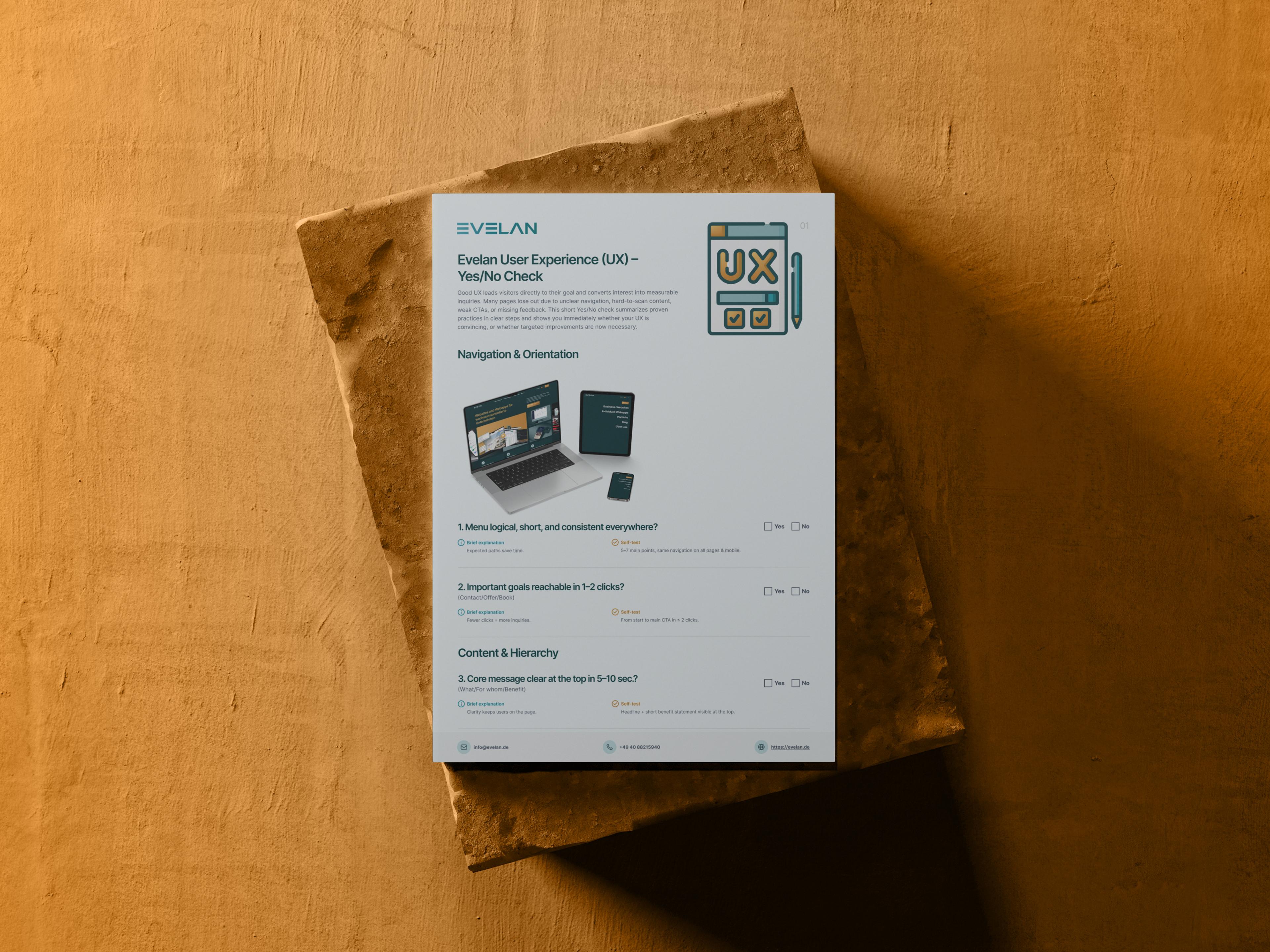
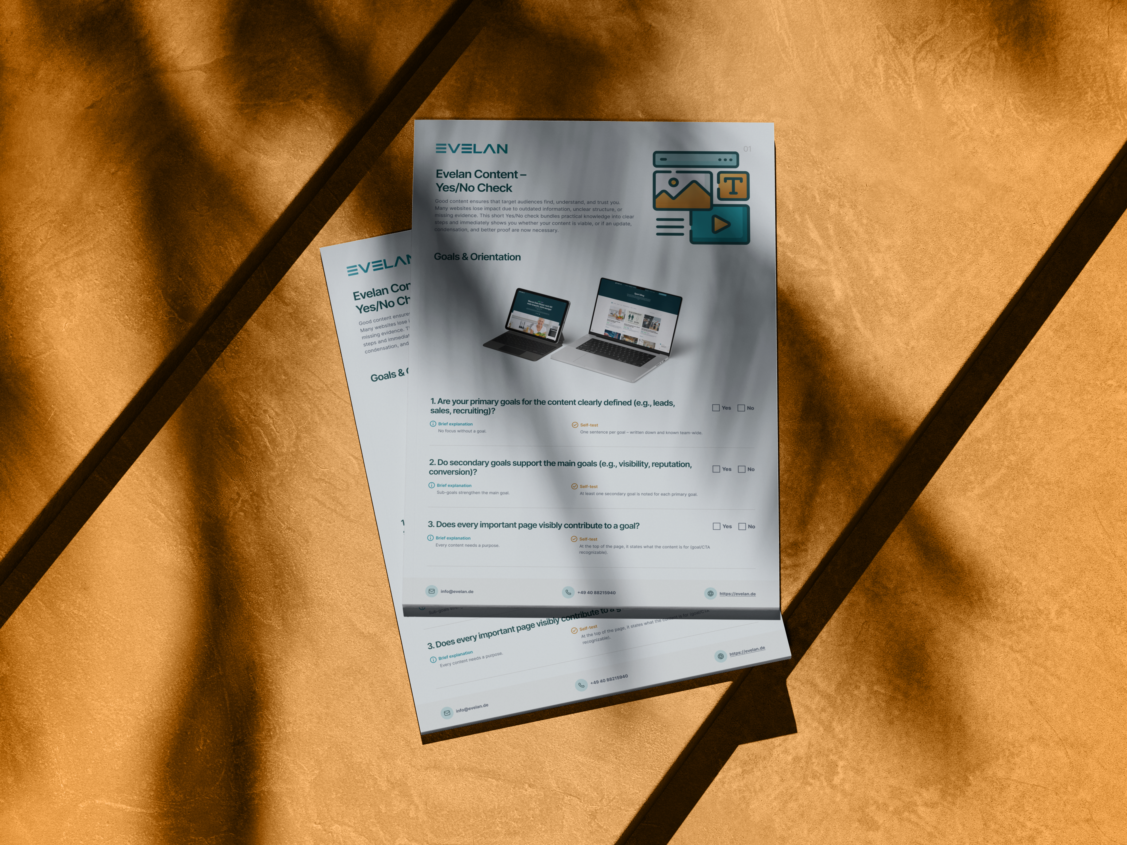
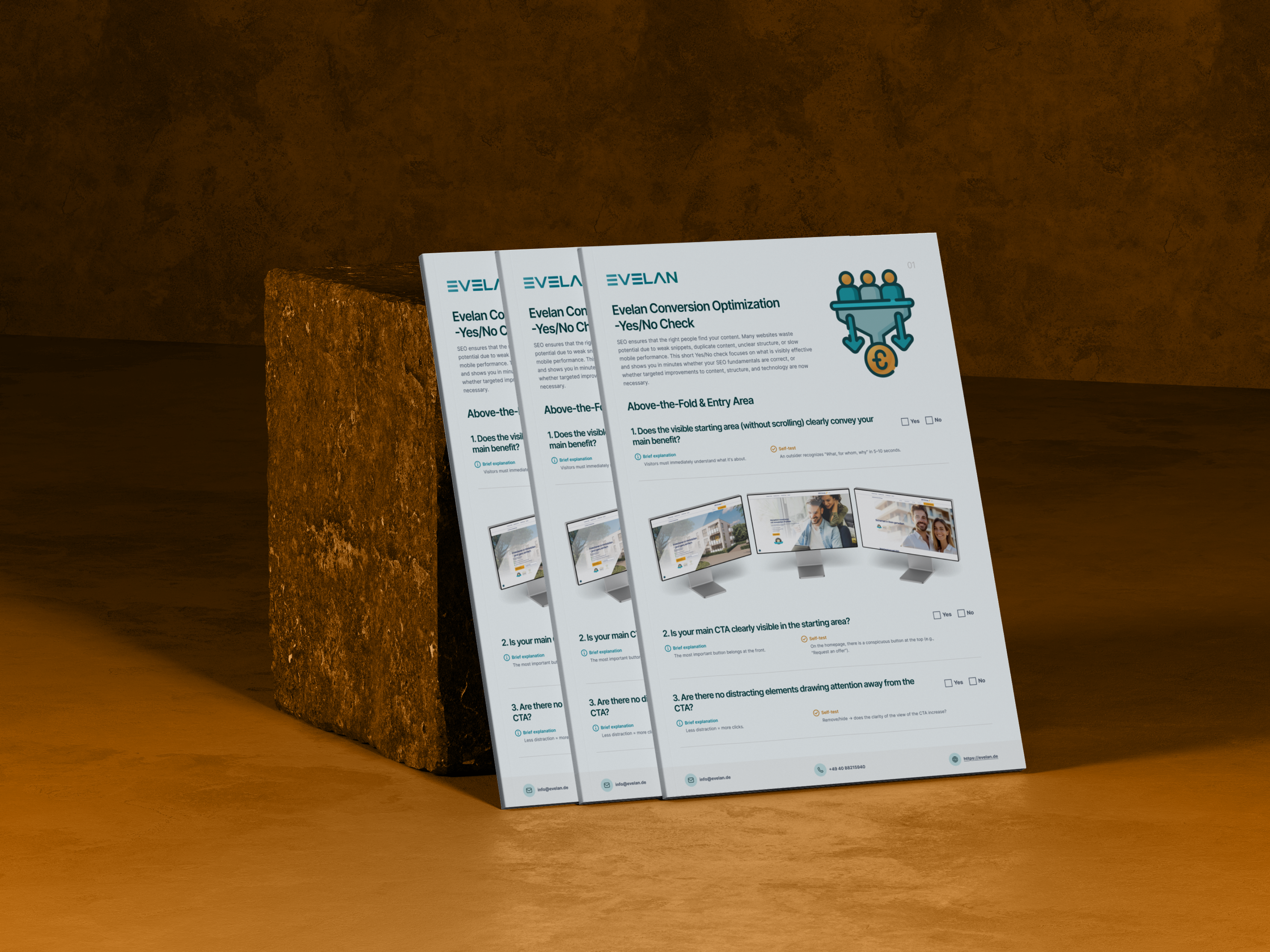
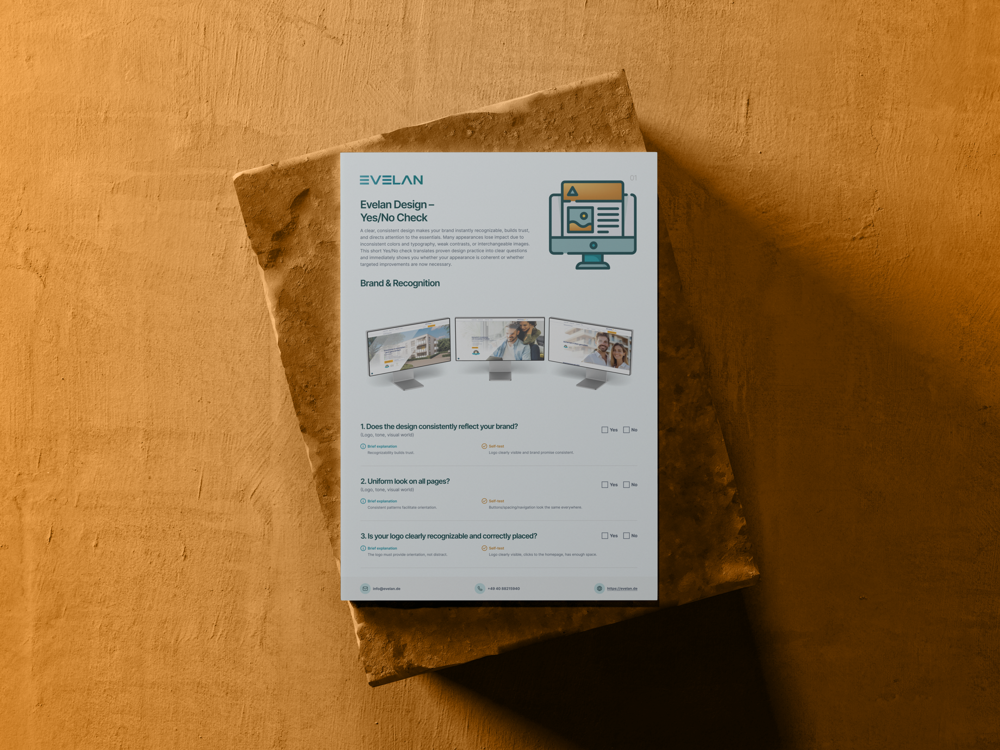
15 checkpoints across 6 categories, a yes/no check for instant clarity on how coherent and professional your appearance looks.
Brand & Recognition
A design consistently aligned with the brand, a uniform look across all pages, and a clearly recognisable, correctly placed logo.
Colour & Typography
A harmonious colour scheme with clear accents, a clean heading hierarchy, and good readability through appropriate font size and contrast.
Images & Graphics
A high-quality, authentic visual language instead of generic stock photos, plus sharp, cleanly and quickly loaded images.
Competition & Impact
An appearance that keeps up with the best competitors, and a design that supports the content instead of merely decorating.
Consistency Across Pages
Uniform layouts, spacing and grids, identical navigation, and a consistent style and wording for buttons and CTAs.
Metrics & Signals
Noticeable bounce rates and short session durations in view, plus heatmaps and click paths that reveal whether important areas receive attention.
A convincing appearance in 3 steps
Download the checklist
Download the free PDF and get an overview of all 15 checkpoints across 6 categories.
Review your appearance
Look at your website with fresh eyes and compare it to competitors, noting where the impression appears inconsistent.
Sharpen the design
Implement the most important improvements yourself or let the design experts at Evelan handle the visual execution.
How your convincing website design is created with Evelan
A strong design is not a matter of chance but follows a clear system of brand, colours, typography and rules. That is exactly what we build on. From the first analysis through the design concept to ongoing support, we shape every page consistently and with an eye on its impact, entirely in-house in Germany. The result is a modern, trustworthy appearance that makes your brand unmistakable and directs the eye to what matters most.
1. Initial consultation
Free and without obligation, we review your current appearance, compare it to the competition, and clarify how your brand should come across. This reveals where the design is still inconsistent or wasting trust.
2. Design concept
We develop a clear design system of colours, typography, imagery and recurring patterns. Every element gets its place so your appearance looks uniform and recognisable across all pages.
3. Implementation
We implement the design with clean code, good readability, clear contrasts and sharp, fast-loading images. Everything is created 100 % in-house in Germany and stays true to your brand.
4. Ongoing support
After launch we keep impact and metrics in view, use data and heatmaps to check where the appearance slows things down, and continuously refine the design.
Why professional design determines the first impression
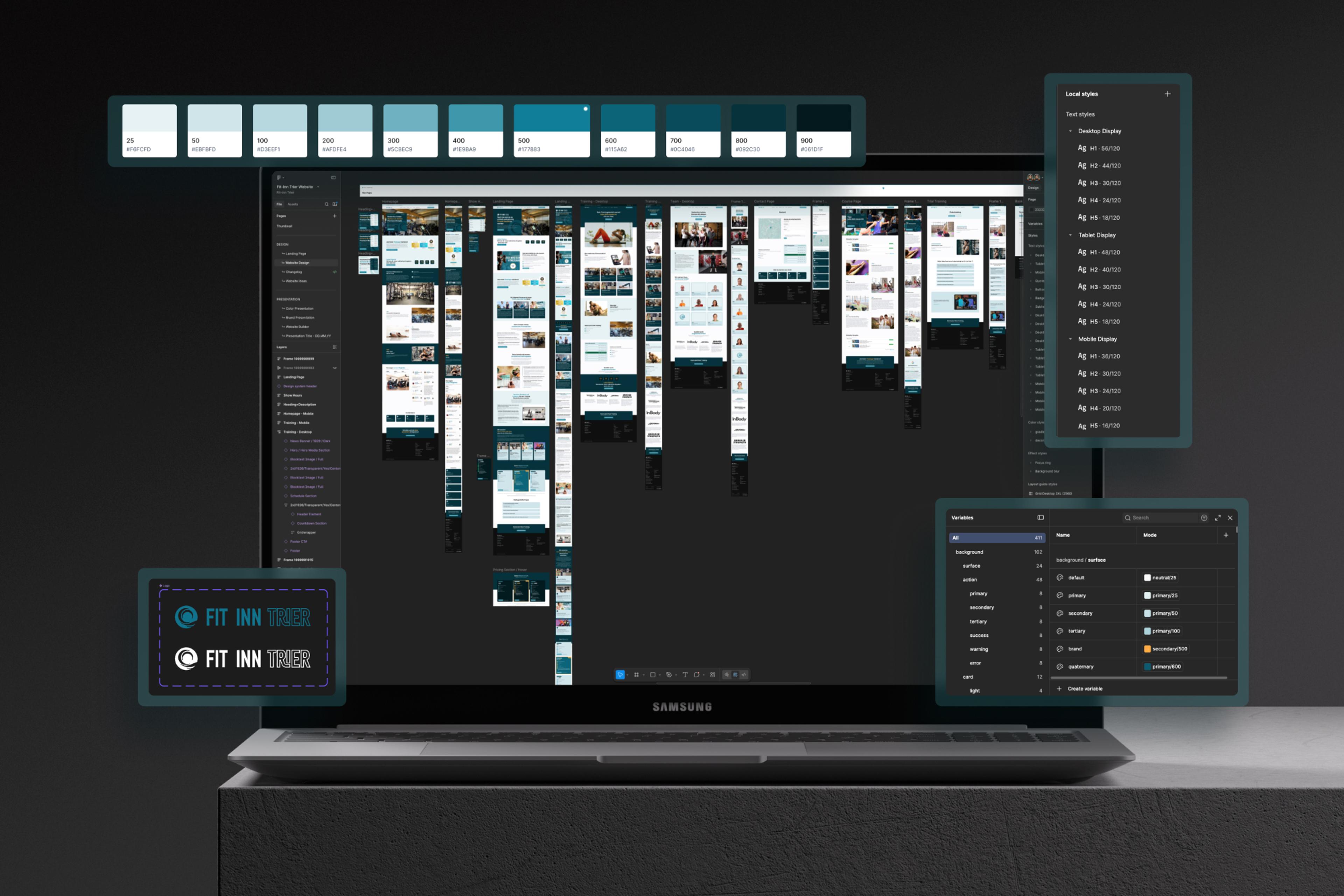
Design is the first thing visitors notice about your website, and the first impression forms in a split second. Before a single sentence is read, the appearance determines whether a page comes across as reputable, modern and trustworthy, or not. A clear, consistent design makes your brand instantly recognisable, builds trust and directs the eye to what matters. Inconsistent colours, weak contrasts or interchangeable stock photos undermine this effect immediately. Good web design is therefore far more than taste; it is a strategic tool that steers attention and encourages action. A structured design checklist helps uncover weaknesses in consistency, readability and imagery before they cost visitors and trust. Those who shape their design deliberately gain an advantage that competitors relying on interchangeable templates can barely match.
Brand and recognition build trust
People trust what feels familiar. A design that consistently reflects your brand, from logo and colours through tone of voice to visual language, creates exactly that recognition. The logo should be clearly visible on every page, link to the homepage and have enough space to provide orientation rather than clutter. Equally important is a uniform look across all pages, because when layouts, buttons and navigation look the same everywhere, the appearance feels professional and considered. If the look jumps from page to page, an impression of randomness quickly arises that weakens trust in your entire offer. Small details like consistent icons or a continuous image style reinforce this effect and round off the overall picture.
Colour, typography and readability guide the eye
Colours and type are powerful tools when used systematically. A harmonious colour scheme with a few main colours and a clearly prominent accent colour directs the eye precisely to what matters most, such as your CTAs. A clear heading hierarchy with one H1 per page and recognisable sublevels guides the reader safely through the content. Equally decisive is readability: body text of roughly sixteen pixels or more, sufficient line height and a pleasantly strong contrast ensure your message lands effortlessly. Where type is too small, too pale or too tightly set, reading becomes strenuous, and many visitors leave before grasping the actual content. Accessible contrasts not only help people with visual impairments but improve readability for every visitor.
Authentic imagery instead of generic stock photos
Images convey emotion and credibility often faster than words. High-quality images that match the content, with realistic scenes, a real team or concrete products, are far more convincing than interchangeable stock photos found on hundreds of other sites. Technical quality matters just as much: images should be sharp, load quickly and appear free of artefacts, because small and sharp beats large and blurry. At the same time, design should always support the content rather than distract from it. A visitor's gaze should flow naturally from the headline through the benefit to the CTA, instead of getting lost in decorative elements without function. A harmonious interplay of image and text feels more credible than any elaborate animation.
Consistency and measurable impact instead of gut feeling
A calm, professional appearance comes from a clear system. When layouts, spacing and grids follow a recurring pattern, navigation and menus are identical everywhere, and buttons share the same style and wording, the visitor does not need to rethink at every step. This consistency lowers cognitive load and builds trust. Good design can also be measured and is not merely a matter of taste. Noticeably high bounce rates or short session durations reveal where the design slows things down, and tools like heatmaps and click paths show whether important areas and CTAs receive the attention they need. This turns design into a verifiable decision that measurably improves your website. In this way you transform design from a pure question of taste into a plannable lever for more impact and enquiries.
Free Design Checklist
Download the free checklist and review your appearance against 15 checkpoints across 6 categories. Or book a free initial consultation with our design experts.
Frequently asked questions about the Design Checklist
Quick answers on usage, services, process and next steps.
The checklist examines 15 points across 6 categories: Brand & Recognition, Colour & Typography, Images & Graphics, Competition & Impact, Consistency Across Pages, and Metrics & Signals. Each point is a simple yes/no check with a concrete self-test you can perform directly on your website.
More checklists for your website
Each checklist covers a different area; together they form a complete website optimisation roadmap.