User Experience Checklist
Good user experience is barely noticed; bad user experience is noticed instantly. If a visitor cannot quickly find what they are looking for, they leave, no matter how strong your offer is. Our free User Experience Checklist shows you with 14 yes/no questions whether your website guides visitors effortlessly to their goal, from navigation through readability and CTAs to accessibility and familiar conventions. As German Web Awards winners, Evelan designs websites that feel intuitive. Download the checklist and make your website more user-friendly step by step.

What does the User Experience Checklist cover?
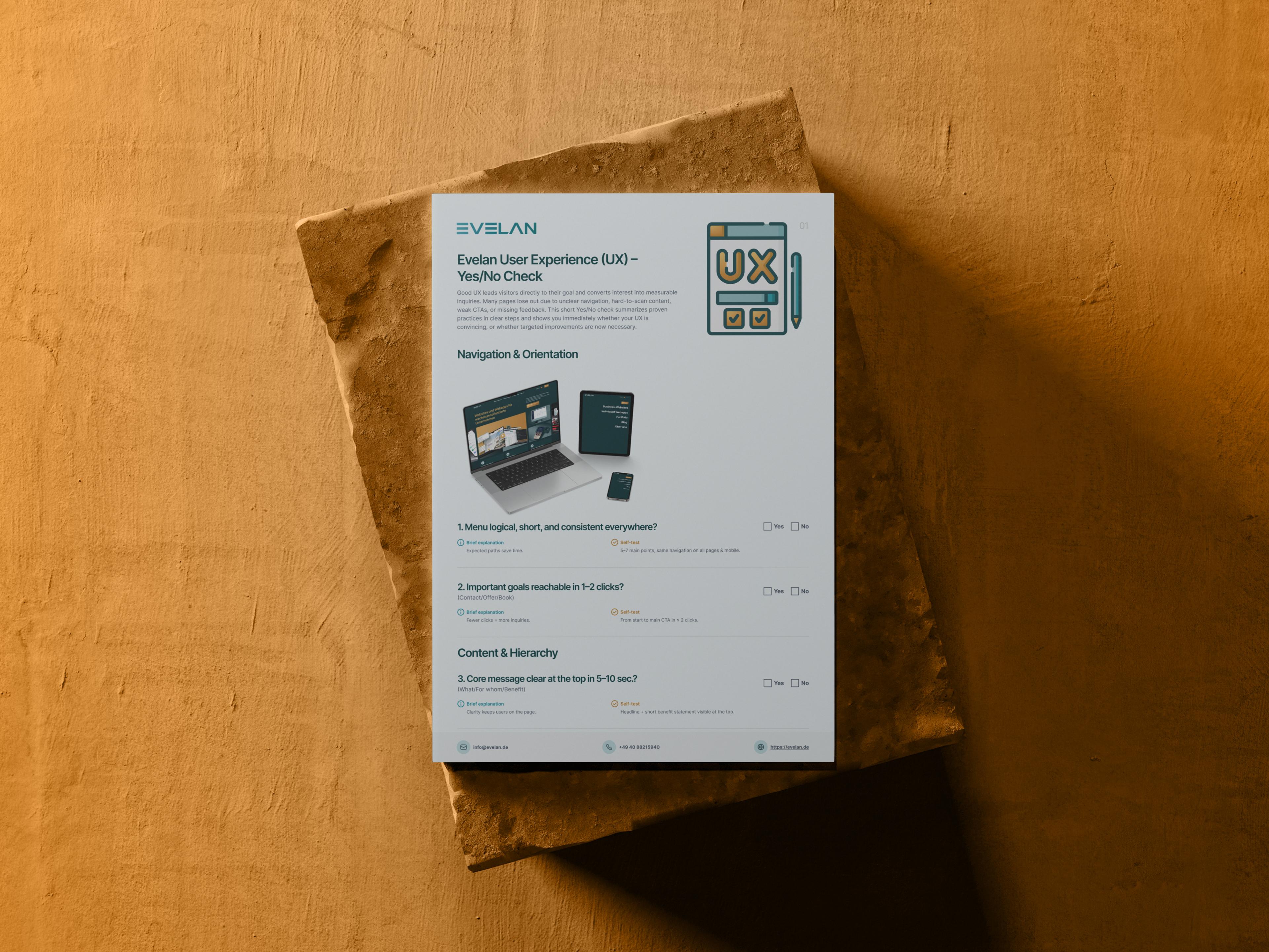
14 checkpoints across 5 categories, a yes/no check for instant clarity on how effortlessly visitors use your website.
Navigation & Orientation
A logical, consistent menu and important goals reachable in one to two clicks give visitors reliable orientation at all times.
Content & Hierarchy
The core message is grasped within a few seconds, and scannable text with subheadings and lists guides visitors effortlessly through the page.
CTAs & Feedback
Clearly labelled, visible CTAs plus forms with instant feedback and sensibly marked, few required fields.
Consistency & Accessibility
Uniform design, alt texts, good contrast, keyboard operability and clearly identifiable links make the website usable for everyone.
Expected Conventions
Logo top-left linking to the homepage, easy-to-find contact details and legal links in the footer meet familiar expectations.
A better user experience in 3 steps
Download the checklist
Download the free PDF and get an overview of all 14 checkpoints across 5 categories.
Test your website
Walk through your website as if visiting for the first time and note where orientation or clarity is lacking.
Improve the experience
Implement the most important improvements yourself or let the experts at Evelan handle the technical execution.
How Evelan builds your user-friendly website
A great user experience does not come from gut feeling but from clear principles and consistent testing. That is exactly what guides us. From the first conversation through the UX concept to ongoing support, we think every page from the perspective of your visitors, entirely in-house in Germany. The result is a website that feels familiar from the very first second, provides clear guidance and brings visitors to their goal without detours.
1. Initial consultation
Free and without obligation, we look at how visitors currently navigate your website and where they get stuck. This reveals where better user guidance makes the biggest difference.
2. UX concept
We plan a clear navigation, a logical content hierarchy and unambiguous next steps. Structure, labels and pathways are designed so visitors can orient themselves effortlessly at all times.
3. Development
We implement the concept with clean code, consistent design, accessible controls and fast responses. Everything is created 100 % in-house in Germany and tested with real users.
4. Ongoing support
After launch we observe how visitors actually use the site and continuously improve weak points. This keeps the user experience permanently clear, accessible and convincing.
Why good user experience determines enquiries and revenue
User experience describes how effortless and pleasant using a website feels. It is the silent factor behind almost every metric, because those who find their way stay longer, read more and are more likely to act. Good UX is barely noticed; it simply feels natural. Bad UX, on the other hand, is noticed immediately, usually as frustration and a quick click back to search. For businesses this directly affects enquiries and revenue, because even the best offer is ineffective if visitors cannot reach it without detours. The great advantage is that many improvements can be implemented with manageable effort yet still deliver a noticeable impact. A structured checklist helps find the typical stumbling blocks in the user experience before they cost you prospects.
Navigation and orientation provide security
Visitors want to know at all times where they are and how to move forward. Good navigation is therefore logically structured, kept concise and identical on all pages as well as on mobile. As a guideline, five to seven main items have proven effective, because too many options overwhelm rather than help. Important goals such as contact, quote or booking should be reachable in one to two clicks. The more predictable the paths, the less the visitor has to think. This orientation creates a sense of security and keeps people on the page, rather than driving them away through searching and guessing. If the navigation breaks from page to page or disappears on a smartphone, that trust is quickly lost.
Scannable content instead of walls of text
Hardly anyone reads a website word for word; most people scan it first. The core message must therefore be clear within the first five to ten seconds, ideally through a prominent headline and a short benefit statement high up. The remaining content benefits enormously from clear subheadings, short paragraphs and lists instead of long text blocks. This way the eye quickly finds the relevant sections and nobody has to fight through dense paragraphs. Well-structured, scannable content noticeably lowers the bounce rate and ensures your most important messages actually land. Descriptive headings that preview the section content and highlighted key terms that anchor the scanning eye further support this.
Clear CTAs and honest feedback
Every page needs a clear next step, and that starts with clearly labelled, visible CTAs. Phrases like Request a quote or Book an appointment guide more reliably than vague buttons like Submit or Next. Equally important is honest feedback: forms should report errors directly at the affected field and show a clear confirmation after submission, such as a thank-you page or a brief email. This builds trust and removes uncertainty. At the same time, forms should be kept as short as possible, because few, sensibly marked required fields convert significantly better than lengthy questionnaires. For an initial contact, six fields or fewer are usually sufficient; everything else can be clarified later.
Accessibility, consistency and familiar conventions
A good website works for all people and every type of interaction. This includes descriptive alt texts for important images, sufficient contrast between text and background, clean keyboard operability and clearly identifiable links. Consistent design, meaning uniform buttons, spacing and language, reduces cognitive load and makes the site feel familiar. Equally important are familiar conventions: the logo top-left linking to the homepage, easy-to-find contact details such as phone number and address, and legal links like imprint and privacy policy in the footer. Meeting these expectations speeds up orientation and signals professionalism. Accessibility and familiarity are therefore not extras for a few but improve the user experience for your entire audience.
Free User Experience Checklist
Download the free checklist and audit your website against 14 checkpoints across 5 categories. Or book a free initial consultation with our UX experts.
Frequently asked questions about the User Experience Checklist
Quick answers on usage, services, process and next steps.
The checklist examines 14 points across 5 categories: Navigation & Orientation, Content & Hierarchy, CTAs & Feedback, Consistency & Accessibility, and Expected Conventions. Each point is a simple yes/no check with a concrete self-test you can perform directly on your website.
More checklists for your website
Each checklist covers a different area; together they form a complete website optimisation roadmap.