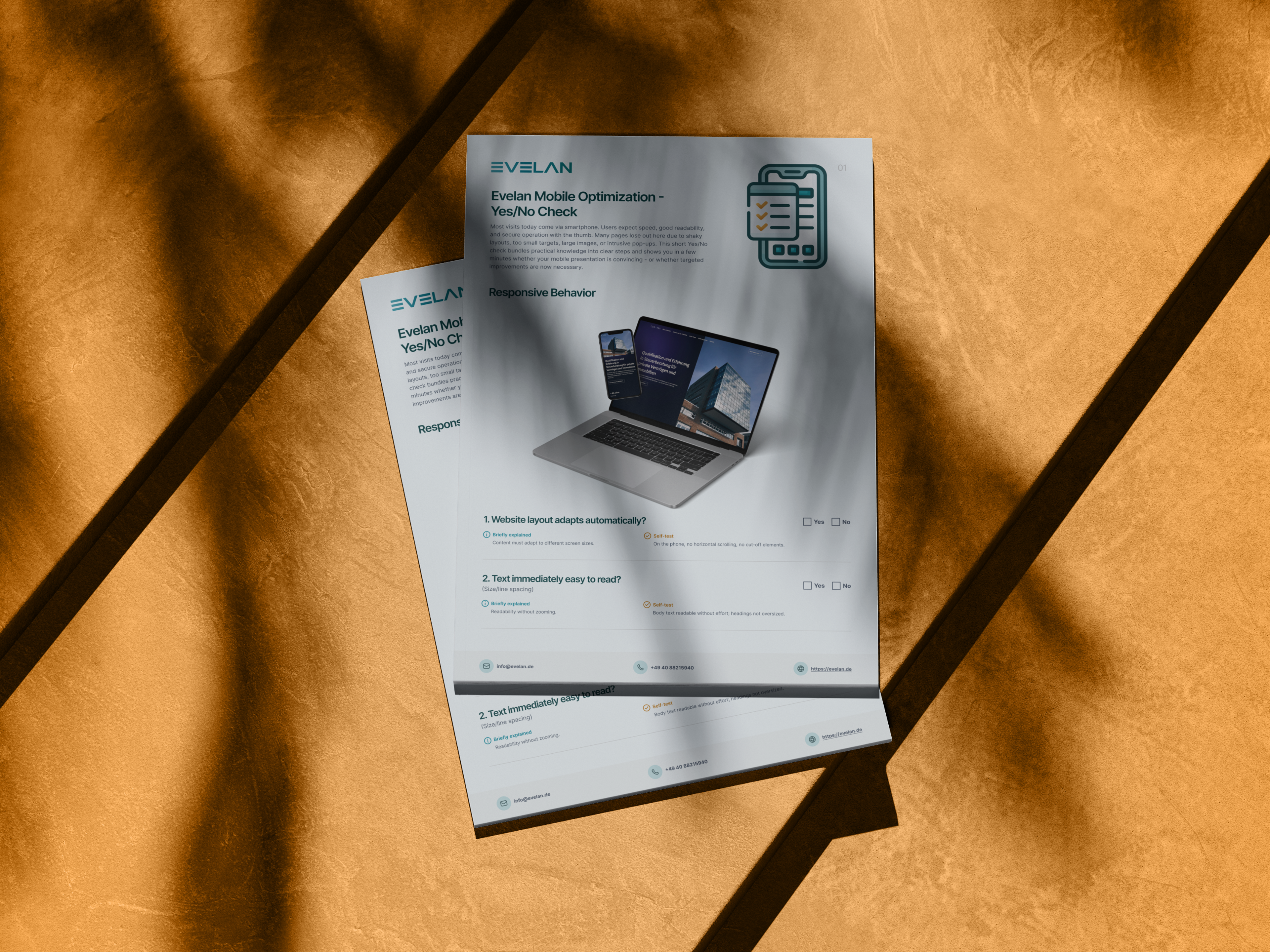
Mobile Optimisation Checklist
More than half of all website visits happen on a smartphone, and there it takes just seconds to decide whether someone stays or bounces. Our free Mobile Optimisation Checklist shows you with 14 clear yes/no questions whether your website truly convinces on mobile, from readability and touch controls to forms and loading time. As German Web Awards winners, we at Evelan build websites that work effortlessly on every device. Download the checklist and improve your mobile website step by step.

What does the Mobile Optimisation Checklist cover?
14 checkpoints across 6 categories, a yes/no check for instant clarity on the mobile quality of your website.
Responsive Behaviour
The layout adapts to every screen size without horizontal scrolling, and content remains fully readable without zooming.
Touch & Navigation
Buttons and links are large enough for the thumb, and the menu is immediately accessible and easy to use.
Pop-ups & Overlays
Pop-ups do not block content full-screen and can be closed at any time with a single tap.
Speed on the Go
The page loads quickly even on a mobile data connection because images and videos are kept lightweight and efficient.
Mobile Forms
Large fields, the right on-screen keyboard, reliable autofill and a clear confirmation ensure forms are completed smoothly.
Mobile Specifics
Mobile features are only used where they offer genuine added value, and they always remain transparent and voluntary.
A convincing mobile website in 3 steps
Download the checklist
Download the free PDF and get an overview of all 14 checkpoints across 6 categories.
Test on your smartphone
Open your website on your phone and work through the points to see where the mobile experience can be improved.
Fix weak spots
Implement the most important improvements yourself or let the experts at Evelan handle the technical execution.
How Evelan builds your mobile-optimised website
A convincing mobile website is not created by shifting things around after the fact, but by putting the smartphone at the centre from the very start. That is exactly how we work. From the first conversation through the concept to ongoing support, we think every decision from the small screen outward, entirely in-house in Germany. The result is a website that works just as effortlessly on a phone as on a desktop, loads fast and guides visitors smoothly through content and forms.
1. Initial consultation
Free and without obligation, we review your website on real devices and find out where the mobile experience falls short, whether in readability, usability or loading time. This gives you a clear picture of where optimisation should start.
2. Concept & mobile-first
We plan structure, navigation and content consistently from the smartphone outward. Controls, menus and forms are designed so they can be operated effortlessly with the thumb before the desktop view is even considered.
3. Development
We implement a clean responsive design with easily tappable buttons, lightweight images and fast loading times. Everything is created 100 % in-house in Germany and tested on a range of devices.
4. Ongoing support
After launch we regularly check that your website works smoothly on new devices and screen sizes, keeping mobile performance consistently at a high level.
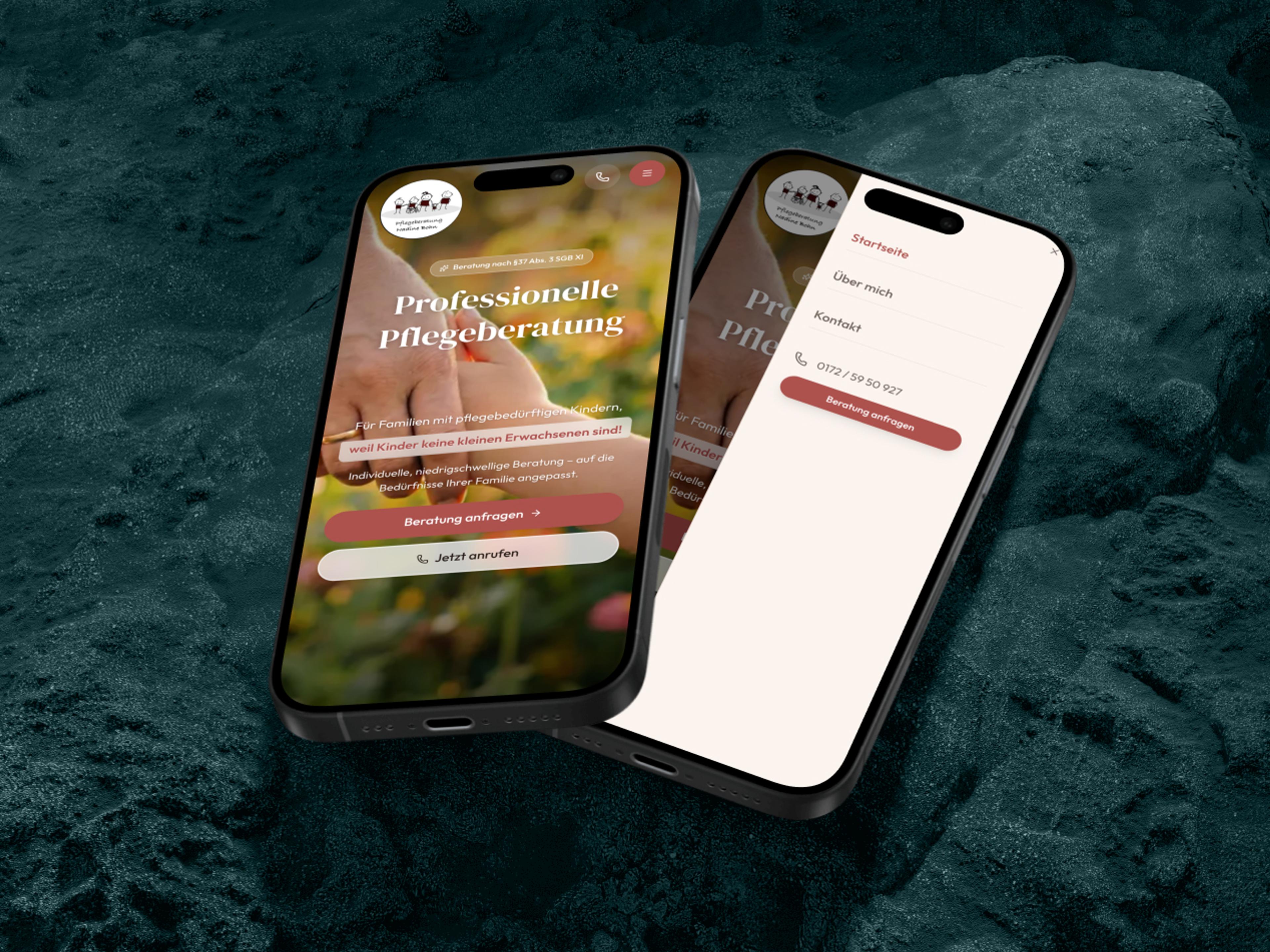
Why the mobile version of your website matters most today
For most people the smartphone is the first and often only way they access your website. If you fail to convince on mobile, you lose a large proportion of visitors before your actual message even arrives. Users today expect speed, clear readability and controls that work effortlessly with the thumb. Wobbly layouts, buttons that are too small or intrusive pop-ups trigger an immediate bounce. Mobile optimisation is therefore not a detail for tech enthusiasts but directly determines how many enquiries and sales your website generates. The first impression on the small screen also shapes how professional your brand is perceived. A structured checklist helps spot the typical weak points early, before they cost you real money.
Mobile first has long been reality, including at Google
Google now evaluates the mobile version of a website first, known as mobile-first indexing. Issues that do not work cleanly on a smartphone directly affect your search visibility, even if the desktop version looks perfect. At the same time, mobile loading times and Core Web Vitals feed into rankings. A website that is slow or hard to use on mobile loses twice, with users and with Google. Taking responsive web design seriously gives you a tangible advantage over competitors who neglect the topic. In practice this means building a solid mobile foundation first and only then refining the desktop view.
Readability and thumb-friendly controls
On a smartphone, people scroll, tap and swipe, usually one-handed and often on the go. Text must therefore be readable without zooming, with sufficient font size and line spacing. Buttons and links need enough area and spacing so the finger hits the right target without accidental taps. The navigation should also be immediately visible and open smoothly, because the shorter the path to the goal, the higher the completion rate. Small targets, nested menus or oversized headings quickly feel frustrating and cost valuable visitors. Good contrast between text and background also helps, especially when reading content outdoors in sunlight.
Forms determine your enquiries
On a smartphone, forms are the biggest hurdle between interest and making contact. Fields and buttons must be large enough and easy to reach so they can be tapped comfortably without zooming. The right on-screen keyboard, a number pad for the phone number or a keyboard with the @ symbol for email, saves time and prevents errors. Reliable autofill automatically places known data into the correct fields, and a clear confirmation after submission removes uncertainty. The fewer fields you ask for and the clearer each one is labelled, the more likely the form will actually be submitted. Each of these details helps determine whether an interested visitor truly becomes an enquiry.
Pop-ups, overlays and mobile features in moderation
Pop-ups should inform, not block content. If an overlay fills the entire smartphone screen and is difficult to close, the visitor is quickly gone. A clear close icon and tapping outside the overlay should therefore be a given. The same applies to mobile features such as location access. They should only be used where they offer a genuine benefit, and should always remain transparent and voluntary. This makes users feel respected rather than patronised, which builds trust and strengthens overall mobile website performance. When in doubt, dropping an intrusive element gains more in the long run than a forced click could ever deliver.
Free Mobile Optimisation Checklist
Download the free checklist and audit your website against 14 checkpoints across 6 categories. Or book a free initial consultation with our mobile website experts.
Frequently asked questions about the Mobile Optimisation Checklist
Quick answers on usage, services, process and next steps.
The checklist examines 14 points across 6 categories: Responsive Behaviour, Touch & Navigation, Pop-ups & Overlays, Speed on the Go, Mobile Forms and Mobile Specifics. Each point is a simple yes/no check with a concrete self-test you can perform directly on your smartphone.
More checklists for your website
Each checklist covers a different area; together they form a complete website optimisation roadmap.
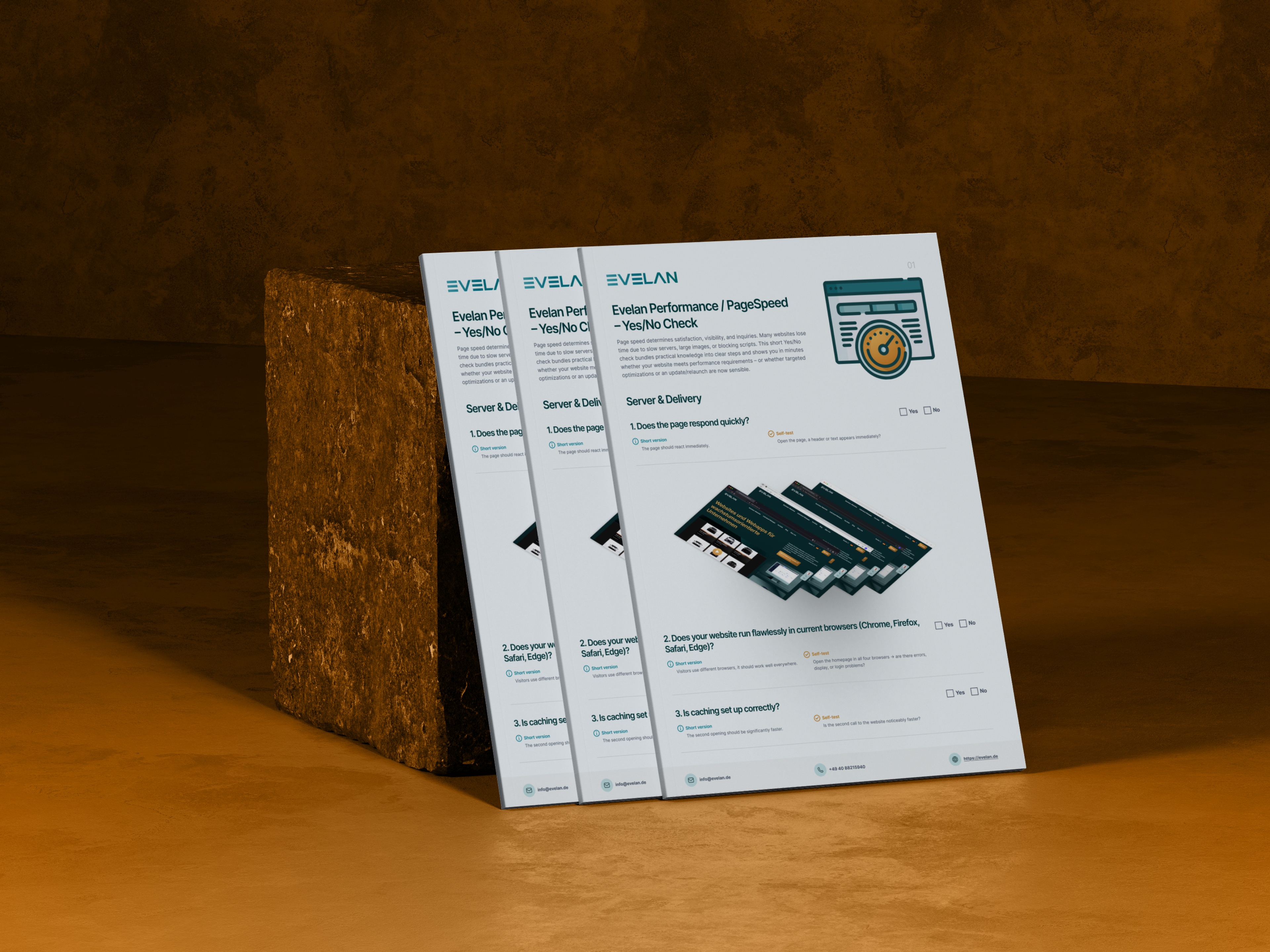
Page Speed Checklist
Improve loading times, Core Web Vitals and technical performance in a targeted way.
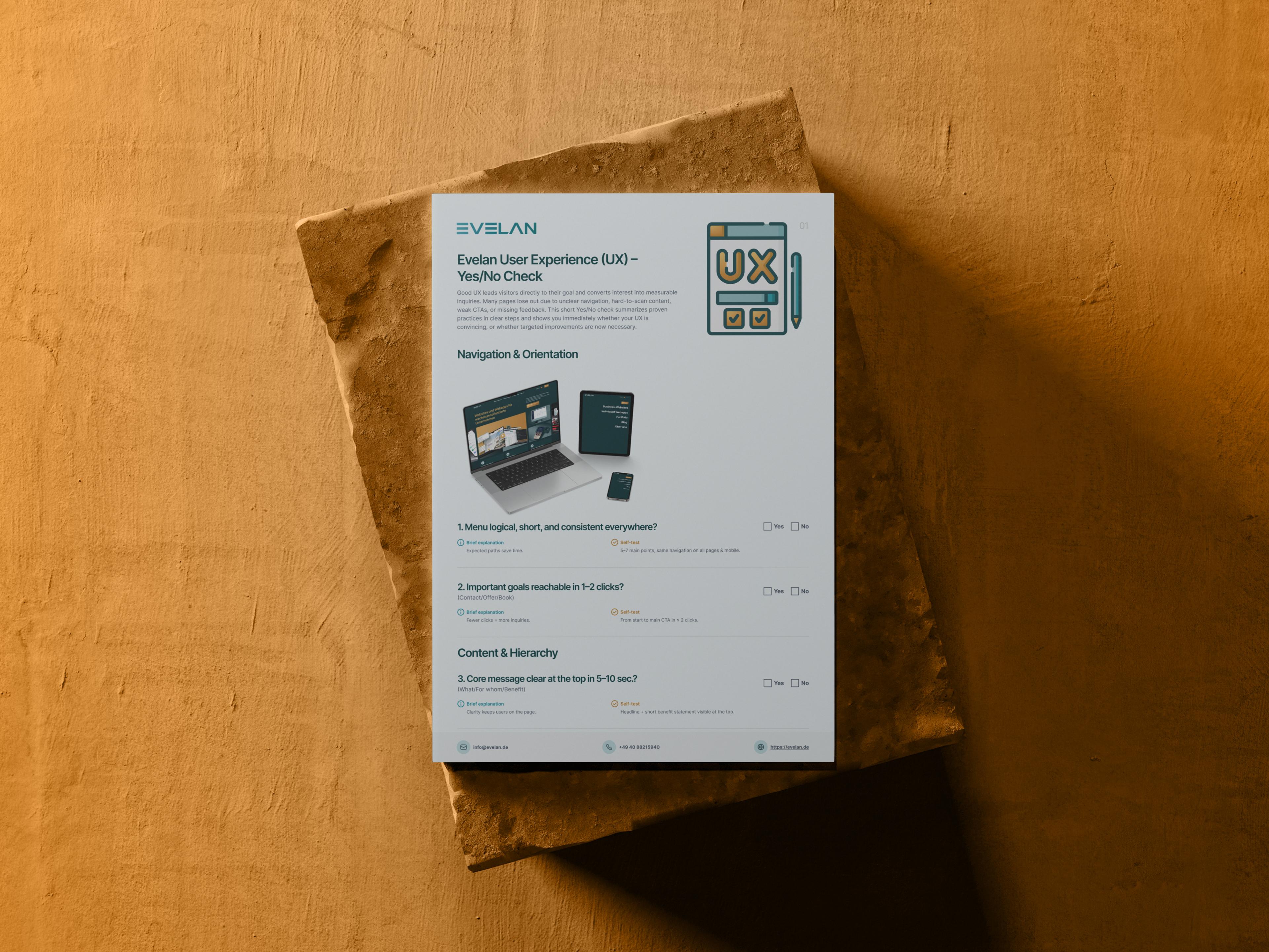
User Experience Checklist
Review user guidance, structure and usability for a better overall experience.
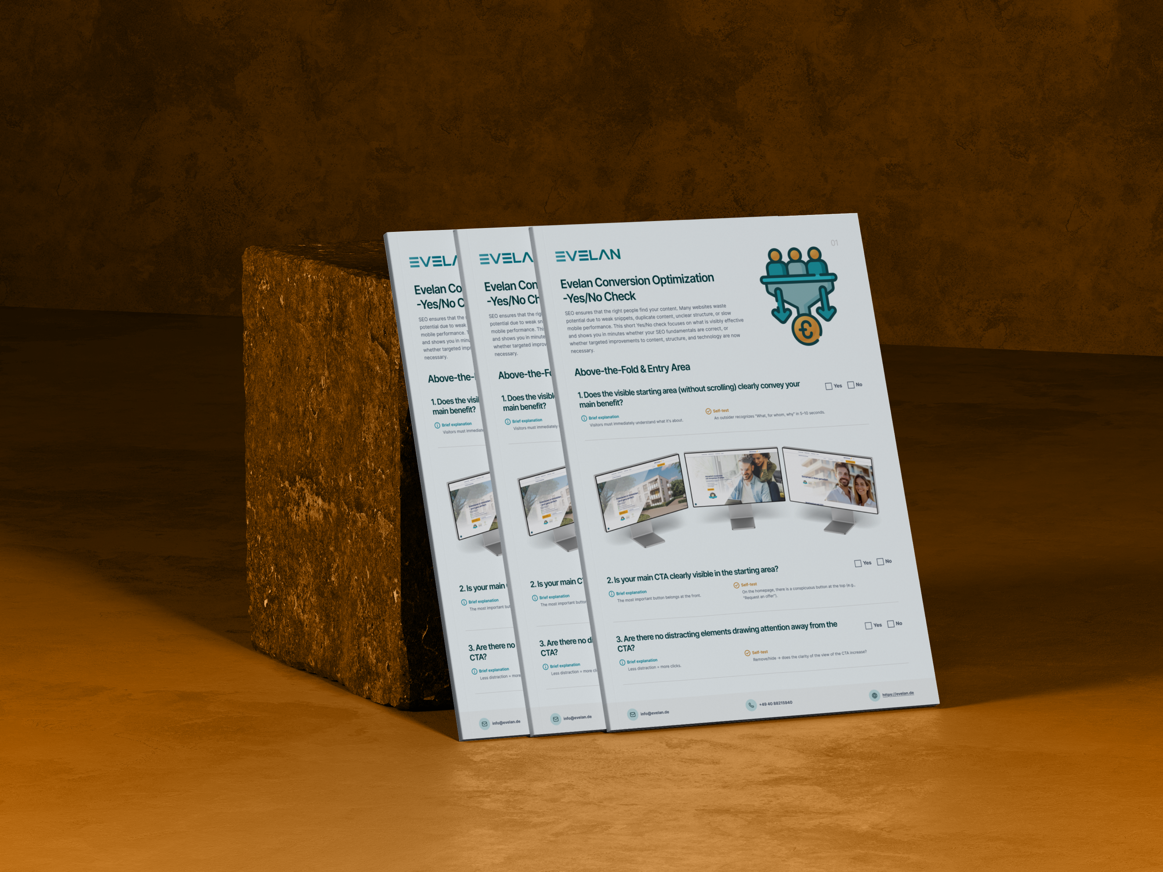
Conversion Optimisation Checklist
Turn visitors into customers with clear CTAs and strong landing pages.